How to Optimize Your Email Newsletter Size to Reach More Subscribers
How long should an email newsletter be? How many pixels wide should you make your header image? Below, we answer all your lingering questions surrounding email newsletter size.
Launching an email campaign requires effective copywriting, on-brand design, and the right functionality. Size plays into all three factors: your copy needs to be short and snappy, your design requires a positive user experience, and a well-functioning email (with a high deliverability rate, no less) relies on the correct size of each design element.
To help you publish a gorgeous, on-brand email — and ensure it lands soundly in recipients’ inboxes — we’re offering a complete guide on email newsletter size.
Size Matters (a Lot) for Email Newsletters

Size is an important element of email design. Size can pertain to the length of your email copy, the width of your images, or even the space (padding) between design elements.
If individual elements or your entire email template aren’t sized correctly, you could run into the following problems:
- Stretched or pixelated images: One key benefit of leveraging email marketing software is aesthetically pleasing campaigns. However, if you don’t upload your email banner or other elements with the right file size, those images appear to have a poor screen resolution.
- Slow load times: You should always resize your images before importing into an email marketing campaign. If not, a full resolution image (which could easily exceed 5,000-6,000 pixels in width) might fail to load in subscribers’ inboxes.
- Decreased deliverability rate: If the maximum width of your images is too large, it could decrease your deliverability rate. Emails that fail to load due to large images can be blocked by email service providers or wind up in spam folders.
- Poor user experience: A great user experience (UX) depends on properly sized elements, including headers, paragraph text, images, and section breakers. In addition, it depends on proper spacing between those elements, so your email content doesn’t appear as though it’s smashed together.
- Decreased subscriber engagement: Who wants to read an email message that fails to load? Who bothers to read an email newsletter that’s too long (e.g., the size of a typical blog post)? Not having the correct image or copy size will decrease engagement and ultimately lead to unsubscribes.
Email Newsletter Size: How to Properly Size Design Elements

To send gorgeous, easy-to-ready emails with a high deliverability rate, you need to know the correct size of each element. Follow this guide to understand how large — or small — your images, banners, and copy should be within each message:
- Email template size: Your template size will vary depending upon your email automation platform and the length of your content. Your template width will typically be 600-700 pixels, while the height will be 1,500-2,500 pixels.
- Email file size: Your email file size limit refers to the maximum amount of files you can attach to your email. Google allows you to send up to 25MB of attachments from your Gmail account.
- Header size: Contrary to popular belief, your email header is not the first content block within your message. Instead, your header contains data such as your to, from, and BCC fields, as well as your subject line. The only true “size limit” applies to your subject line, which should be capped at roughly 60 characters.
- Preheader size: Your preheader text is the preview text seen next to the subject line in a recipient’s inbox. You should cap your preheader text to 40-130 characters. Remember — the longer your subject line, the less space available for preview text.
- Padding size: Padding refers to the white space between elements. Always include 50-150 pixels of space between each element to improve readability.
- Banner size: Your email banner is the intro block within a newsletter template. A typical banner will be 600-800 pixels wide and 400-1,000 pixels tall, depending on how much content you pack into the introduction.
- Image size: Images are inherently large files, and should always be resized to speed up load times. A full width image should be 600-800 pixels wide. An image used within a two-column design will be 400 pixels max, while images in a three-column design will be roughly 250 pixels wide.
- Content block size: Each content block within your email newsletter design will be the standard width of your message, or 600-800 pixels. The height of each block will vary depending upon the content included, but is typically 400-1,200 pixels.
- Email footer size: Your footer typically includes your business address, unsubscribe links, social media links, and perhaps a 1-2 sentence company description. Your footer will be 600-800 pixels wide and 100-250 pixels tall.
- CTA button size: Your call-to-action (CTA) button leads to a sales page or other page on your website. Most CTA buttons are 50-200 pixels wide and 40-70 pixels tall, depending on your link text.
- Copy length: Email campaigns are meant to be short-form mediums. In contrast to long-form copy (typically used in blog posts), digital marketing campaigns are meant to be short and efficient. A transactional email (like a sales blast) could be a mere 50-150 words in length, while a longer email (like a monthly newsletter) could extend to 300-500 words.
Tips for Sending a Gorgeous, User-Friendly Email
Properly resizing design elements is imperative to sending an aesthetically pleasing, on-brand email. However, to ensure your campaigns have the best user experience possible, follow these tips:
- Always test your emails: Always, always, always send a test email to yourself before blasting your entire list, versus simply using the preview pane. Open your test email in your inbox and see all images properly loaded — if not, it could be a sign they need to be resized.
- Include alt text for your images: As a best practice, you should include alt text for your images. That way, if a design element fails to load, your subscribers know what that image entailed.
- Use large files sparingly: While media such as videos and GIFs add a little flair to your message, these are extremely large files. Therefore, use this media sparingly, sticking to just one video and 1-3 GIFs per message.
- Ensure your message is optimized for mobile: The vast majority of your subscribers will read your message on their mobile devices. Use a template that’s optimized for both desktop and mobile to offer the best user experience.
Start Sending On-Brand Emails With Gumbamail

To send a good email campaign, you need to properly size each design element. Large files — including attachments, images, or GIFs — can slow down load times and ultimately damage your deliverability rate.
To send beautiful emails, start by 1) using a mobile-optimized template from a trusted email marketing platform and 2) always resizing your elements. The average email width is 600-800 pixels, so most images should be resized to be 800 pixels wide, max. In addition, remember to keep your copy short and to the point, anywhere from 100-500 words.
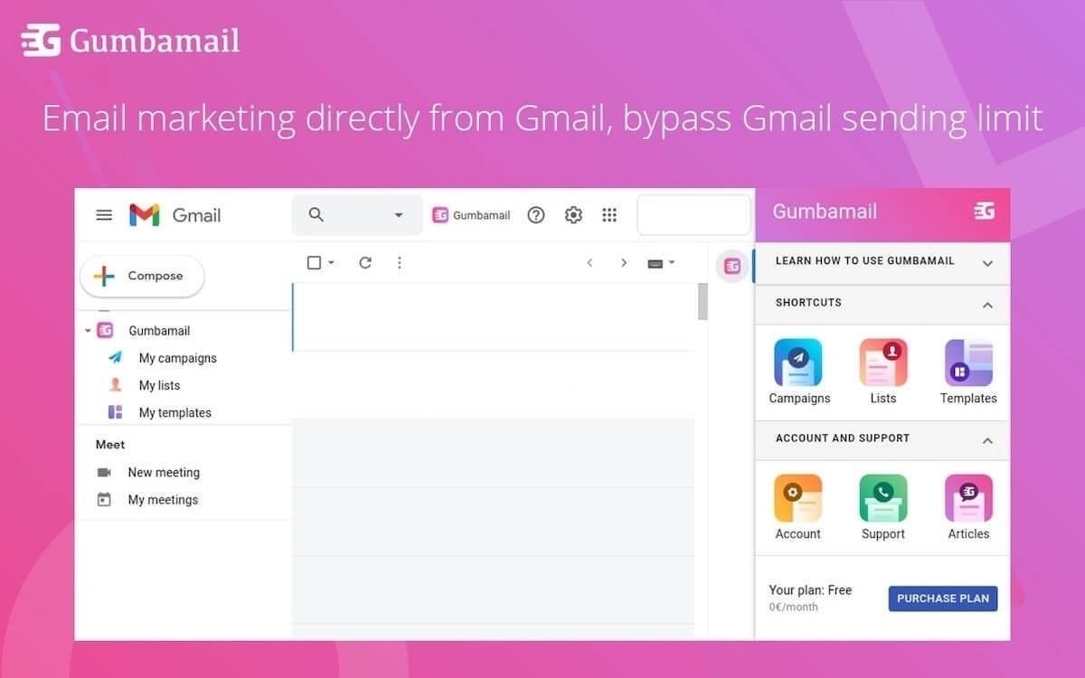
To launch your first email campaign, use Gumbamail. Gumbamail is the easy-to-use, affordable email platform that works in conjunction with your existing Gmail account. Ready to see how Gumbamail can help transform your email marketing strategy? Download the free plugin today.


