8 Email Design Best Practices All Business Owners Must Know
What transforms a good email into a great one? It’s not just about choosing a pretty template or selecting the most trendy background colors. Instead, a well-designed email doubles as an effective email — one that boosts conversions and creates a positive user experience (UX) for the recipient.
Email design best practices extend beyond the realm of brand colors, typography, or imagery. Impactful design combines well-outlined body copy, a sectioned layout, and a clear call-to-action (CTA). Lastly, a well-designed email message is one that’s backed by data; meaning, it’s not effective if it doesn’t increase sales for your company.
Below, we explore eight email design best practices every small business owner should know and implement.
8 Email Design Best Practices for Your Small Business

If you want to convert email recipients into paying customers, you need to rethink your email layout, copywriting, and design elements. Implement these eight email design best practices to increase your return on your marketing strategy:
1. Remember that Less Is More
When it comes to email copy, brief is best.
According to Statista, the average person spends a mere 10 seconds reading an email. Therefore, most email campaigns should be 100–300 words at most. With transactional emails, such as a flash sale, the entire body of your campaign could be 50–80 words.
Because copy dictates design, keeping your message short and sweet will ensure you send a succinct campaign. Don’t flood your message with too many images or graphics. Instead, choose a clean layout to ensure readers perform a desired behavior, such as guiding them toward your main CTA button.
2. Always Swap Out Branding Elements
More often than not, you won’t be creating HTML code from scratch for an email. Instead, you’ll use a digital marketing platform that comes with pre-built email templates included. While templates can help speed up the email design process, they should never be used as an out-of-the-box solution.
Your email marketing campaigns are an extension of your brand. Therefore, you should always swap out stock images, fonts, and color palettes to fit your branding. Design your emails just as you would a page of your website or a post within your social media channels, creating a cohesive experience for your subscribers.
3. Always Design for Mobile First
Nearly 60% of all web traffic takes place on mobile devices, yet nearly one in five emails is not optimized for mobile. To ensure you get the greatest return on your email investment, you need to pay close attention to responsive design.
Responsive emails allow your campaign to look beautiful on any device — including desktops, tablets, and smartphones. Use an email builder that will optimize each template for mobile, and always test your campaign on both desktop and mobile devices.
4. Make Use of White Space

Have you ever landed on a website that feels a bit cluttered? Does it drive you to make a purchase? Of course not! Typically, cluttered design feels overwhelming to the viewer, causing them to exit the page.
Frankly, the same scenario can be said for cluttered email campaigns.
If too many design elements are stacked on top of each other, your email subscribers will immediately delete your message or unsubscribe completely. To boost conversions, make efficient use of white space, placing sufficient padding between elements (typically 60–100 pixels is a good rule of thumb).
5. Use Headers for Each Section
Want to know the biggest mistakes business owners make when drafting email content? Treating it like the next great American novel.
Far too often, we see one-column email messages that include paragraph after paragraph of content, with no section breakers, headers, or columns to break up text. Instead of writing an email like you would a book chapter, treat it like a landing page, where content buckets are distinctly separated by sections. This allows readers to quickly scan and absorb your message.
Start with these pointers: Begin each section with a header (H2 or H1), keep most paragraphs to a couple of sentences, and avoid single column layouts after your introduction. Multi-column layouts tell the reader that there’s a choice to be made (for example, a three-column layout could tell readers to choose between viewing three different products).
For example:
This is the header (H2) of your email
Here is where you would write 1–2 sentences explaining the point of your message. For example, you could write a couple of sentences on your upcoming fall product line.
| PRODUCT 1 | PRODUCT 2 | PRODUCT 3 |
| Each product is written as an H3 header, below your main H2 header. | The three-column layout tells the reader there’s a choice to be made between three products. | This is an easily scannable email for your reader, versus stacking your opening paragraph and three products on top of one another. |
[ Finish with a CTA button ]
6. Avoid Large Media Files
Here’s one email design best practice most creative marketers don’t like to hear: When it comes to imagery, it’s best to keep things simple.
Media content like GIFs, emojis, videos, animations, or infographics may be fun, but they have a tendency to trigger spam filters. These media files (particularly videos) are incredibly large and may not load for your target audience. In addition, full-resolution images can often exceed 6,000 pixels, which are far too large for the average inbox. Instead, always resize images (800–1,000 pixels in length is great) and use alt text on the off-chance your email doesn’t load.
7. Know Exactly What Action You Want Readers to Take
When you design emails, you should have a specific goal in mind. The goal of a single message shouldn’t be to only increase open rates or click-through rates.
Rather, the goal should be the desired action you want readers to take. Do you want them to sign up for a webinar, purchase tickets for an event, clear out old inventory, or order a new product? Every element of your email should focus on achieving this end goal.
Lastly, remember: Avoid using too many CTA buttons, as it can be distracting to readers. Instead, focus on assigning one main CTA for each marketing email, increasing the likelihood that the desired behavior will take place.
8. Always Tie Your Email Design Best Practices Back to Data
It doesn’t matter what type of email you send, whether it’s a monthly email newsletter or a sales blast — every campaign should be analyzed afterward.
Great emails lead to great results, including increased email opens, more clicks, increased website visits, and ultimately more sales. Dive into various marketing metrics after each campaign to determine which tactics worked and which fell flat. Then, pivot your strategy accordingly.
If you notice a dip in campaign performance, switch things up. Consider A/B testing email subject lines or preheader text, experimenting with new layouts, or implementing dynamic content based on various segments.
Implement These Email Design Best Practices With Gumbamail

Effective email design combines your brand identity, snappy copy, and an easy-to-digest layout to increase conversions for your company.
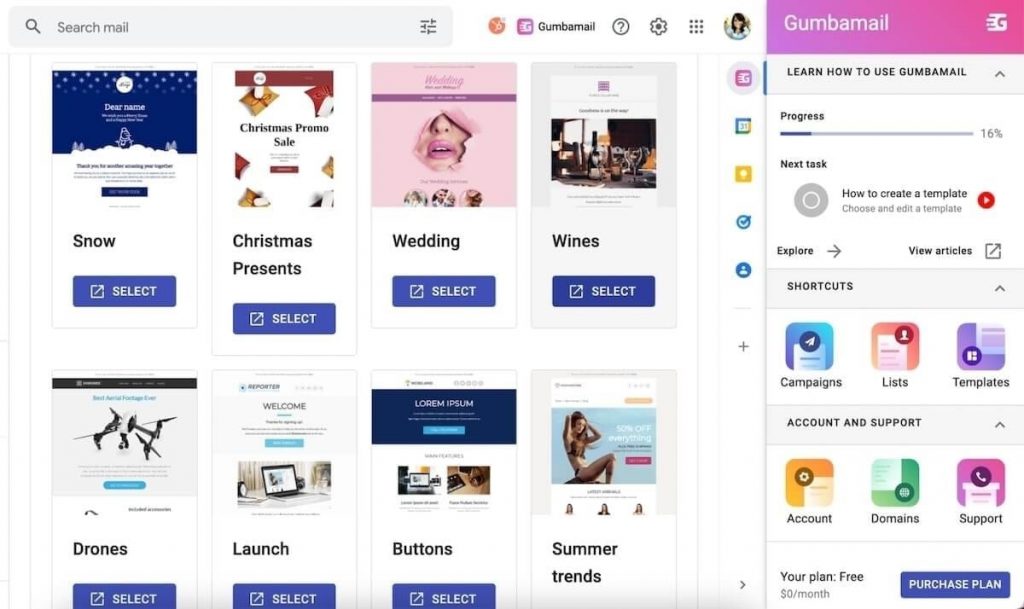
To implement the above best practices, you need the right tools. Use an email automation platform that offers pre-designed email templates, responsive emails, a drag-and-drop email builder, and advanced reporting to execute your marketing strategy.
To gain access to all of the above, download Gumbamail. Gumbamail is the user-friendly email plugin that works in conjunction with your existing Gmail account. Gumbamail comes complete with more than 800 on-brand templates, advanced reporting metrics, and a drag-and-drop editor to bring your campaigns to life. Plus, Gumbamail comes with a forever-free plan, and paid plans start at just $9 per month — fitting perfectly into your small business budget.
Ready to see how Gumbamail can transform your email design strategy? Download the free plugin today.


