6 Common Email Marketing Design Mistakes (and How to Fix Them)
Want to capture readers’ attention with your latest email campaign? You’ve got 10 seconds.
Research by Statista states the average person spent 10 seconds reading a single email in 2021 — a stat that’s rarely budged over the past 10 years. In 2011, individuals spent 10.4 seconds reading emails, and in 2018 people dedicated a 10-year high of 13.4 seconds to each message.
Translation: Subscribers may scan the first two to three sentences of your email marketing campaign before taking action. And if those brief bouts of copy don’t resonate, the “action” taken could be to send your carefully crafted campaign straight to the trash (or worse, hit the unsubscribe button).
Brief subscriber attention spans — coupled with high unsubscribe rates and overflowing inboxes — is why email marketing design is so important. Effective email design combines snappy copy, powerful call-to-action (CTA) buttons, on-brand imagery, and a smooth user experience (UX) to entice subscribers to take a desired action. Below, we dive into the most common misconceptions surrounding email marketing design — and what to do instead.
6 Email Marketing Design Mistakes to Avoid

Email can be one of the most lucrative marketing channels at your disposal — earning an average $36 for every $1 spent — but only when done right. Unfortunately, many business owners approach email design in the completely wrong way. Here, we share several email design best practices to incorporate into your digital marketing strategy.
1. Writing Too Much Copy
Repeat after us: An email message is not a blog post.
Email copy is meant to be a short-form medium — not the drafting of the next great American novel. Many beautiful emails can be written with 100 words (or less!) which equates to roughly two brief paragraphs.
Remember the 10 second rule? If your message includes multiple long paragraphs, chances are it won’t get read anyways. To ensure your copy makes the biggest impact, follow these tips:
- Start with the most important information: Treat your email like a New York Times article. Everything you need to know is within that first paragraph, with more minor details included further down the message.
- Use the “two scrolls” rule: The overwhelming majority of email messages (66%) are read on mobile devices. If your email message can’t be read within two scrolls on your phone, it needs to be cut.
2. Not Using Headers
Many business owners write email blasts the same way they would a quick text to a friend. Their entire message is smashed into a single block of text, with zero regard for user experience.
This poses a problem for two reasons: 1) it doesn’t tell the user’s eyes where to travel and 2) it doesn’t explain which parts are most important. Instead, use section blocks, headers, and subheaders to make your email more scannable:
- Challenge yourself to use three headers per email: This includes one header and two subheaders. For example, your header informs the reader of an upcoming sale while two subheaders could highlight popular products.
- Write an outline before drafting your message: If you struggle with headers, write an outline first. Outlining forces you to prioritize your thoughts into significant ideas and smaller details, helping you compose your message.
3. Not Staying On Brand
Email templates are excellent tools to help compose a well-structured message. However, email newsletter templates aren’t an out-of-the-box solution — instead, you should customize them to fit your brand.
Colors, fonts, and imagery should all be swapped out to fall within your brand guidelines. If you don’t know where to start, follow these steps:
- Use your own color scheme and typography: The fonts you use for headers and paragraph text on each email should match those used within your landing page or web design. And while you shouldn’t use every swatch within your color palette, consider customizing your CTA buttons and headers.
- Don’t use generic imagery: If you don’t have professional product photos, it’s OK! Today, many phones take high-quality images, allowing business owners to produce product shots on the fly. Or, you can consider searching for unique images using a royalty-free site such as Unsplash, Pexels, or Burst.
4. Straying From a Single Idea
Smashing a lot of information into a single message can distract readers, thereby preventing them from taking a desired action. If your open rates are high but your email content isn’t leading to conversions, it’s a sign you may need to streamline your messaging.
Each email you write should focus on a single concept, whether it’s an upcoming sale or a new product line. If your message feels a bit all over the place, try the following:
- Break your email into a campaign series: Streamlining your content doesn’t necessarily mean deleting it all together. Instead, transform your dynamic content into a three-part email series, where each message focuses on a single thought.
- Use one CTA button: Using too many design elements makes for a cluttered, confusing email. Increase click-through rates (and e-commerce sales!) by using one eye-catching call-to-action button, driving readers toward the desired destination.
5. Not Designing for Mobile
Designing a good email starts with understanding how your target audience absorbs information. As stated earlier, many email users aren’t browsing their inbox while seated quietly at a desk. Instead, they’re on-the-go, scrolling through their phones.
Today, the vast majority of pre-built email templates come with responsive design (i.e., they work for both desktop and mobile screens). However, it’s still important to keep the following concepts in mind:
- Optimize white space: Reading an email on your phone (clearly) means reading on a smaller screen. Therefore, you need to be conscious of white space, leaving an appropriate amount of room between design elements to improve readability.
- Be cautious of too many images: Checking email on-the-go means cell service and Wi-Fi access will vary. Large images (like infographics or GIFs) are notoriously slow to load, particularly within responsive emails. Always resize your images (800-1,000 pixels wide is plenty) and use alt text (alternative text) in case the image fails to load.
6. Forgetting About Functionality
Let us leave you with this: It does not matter how aesthetically pleasing your email is if it doesn’t have the functionality to back it up.
You can research all the email marketing design trends you want, but in the end your email must load within a reasonable amount of time, contain correct links, and display on any device. Your subscribers’ time and inbox space is valuable, and therefore you should ensure your newsletter design delivers on the following:
- Make it easy for readers to unsubscribe: Clearly posting unsubscribe links isn’t just courteous, it’s legally required. Include links in your footer where readers can unsubscribe or update their email preferences.
- Always test before sending: Mistakes happen, and unlike a blog post or social media caption, you can’t correct it once you send your email. Always send a test email to yourself or your team testing all links, gauging image load times, viewing your message on mobile, and doing a final proofread.
Start Sending Gorgeous Email Campaigns With Gumbamail

Email marketing can help increase sales for your business, but only when done correctly. Unfortunately, email marketing design is an area that’s often misunderstood.
To send a well-crafted email, optimize it for mobile, focus on one clear concept, and include your company branding. Starting with a pre-designed email template can help with all of the above — which is where Gumbamail comes in.
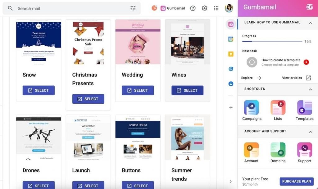
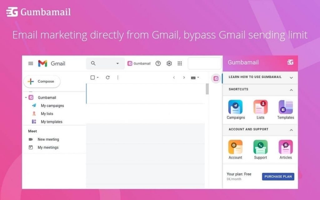
Gumbamail is the easy-to-use email marketing platform that works in conjunction with your existing Gmail account. Gumbamail comes with 800+ professionally designed email templates that can be easily customized through a drag-and-drop builder.
Ready to see how Gumbamail can transform your email design? Download the free plugin to get started.


